Who’s not familiar with it, Yakult’s signature bottle. Small, but behind that unassuming bottle is a big mission. That mission is to contribute to contribute to the health and happiness of all people around the world. In doing so, Yakult today remains true to the philosophy of founder Dr Minoru Shirota. He was convinced that prevention was better than cure, that health should be accessible to everyone and that a healthy gut is essential for our wellbeing. His vision is still central to everything Yakult does. The packaging – as we know it from the supermarket – is one of the most visible communication tools Yakult has at its disposal. That makes attractive and appealing design obviously of great importance and should convey with the overall look what the brand stands for. Moreover, the packaging is also a ‘tiny platform’ to get the most relevant information about the goodness of Yakult across. The bottle not only has a mission (Bottle on a mission), but also a good story to tell. A story about our intestines and the crucial role our ‘second brain’ – as intestines are also called – plays if we want to take good care of our body.
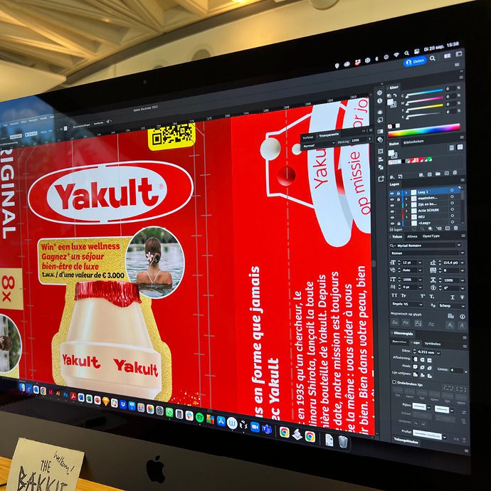
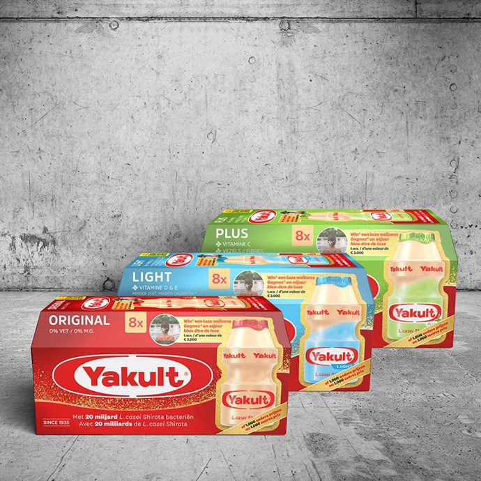
SowiesoHelder has been involved in producing Yakult’s packaging for many years. Both for the three different varieties (Yakult Original, Yakult Light and Yakult Plus) and for the different sizes (8-pack, 15-pack and special seasonal packaging). That packaging is used in several European countries. To have variation on the shelf from time to time in addition to the familiar look, and to be able to use the packaging from a brand activation point of view, this time SowiesoHelder was asked to unleash some creativity on this. More concrete: “Develop a design calendar (with at least 6 ideas) for temporary Yakult packaging that we can use for the next 2 years. Please keep two requests in mind as a hook for the designs: one link with seasons and one link with the Asian calendar and the year of the Tiger. And beyond that… surprise us.”
Of course, that ‘surprise-us-message’ was not said to deaf ears. For the agency’s creative (design) team, these are the bread and butter of design. So, from the brainstorms came many ideas. Partly impractical, unfeasible, or too creative. Because a packaging will be in circulation for at least two to three months, for instance, this practical limitation had to be taken into account: special campaign packaging for Mother’s Day or Valentine’s Day is therefore not an option. But that’s what brainstorms are for. In the end, the ideas were filtered down to the best eight; proposals that had a high chance of reaching the finish line. Both ideas focused on the two requests (season and Asian calendar) and some ‘wild’ designs. In a slide deck of almost 80 pages, the team finally presented the new proposals, complete with the rationale for each proposal so that each visual design also made conceptual sense.
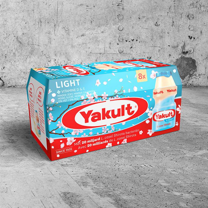
The creative journey eventually led to two new packaging designs that found their way onto supermarket shelves. Spring 2022 featured the sakura (cherry blossom) design, which provides a cheerful link to the beginning of spring, and also refers to Yakult’s Japanese origins. The second design was the Golden Bottle (the golden Charlie and the chocolate factory wrapper under the Yakult bottles, so to speak), design that inspired the promotional packaging currently in shops. An action pack with golden sparkle; customers who buy this Yakult pack have a chance to win a wellness weekend or one of many other ‘health’ related prizes. Gifts that naturally tie in with the mission everywhere: to contribute to the health and happiness of all people around the world. A sympathetic action. Exactly what you expect from a brand like Yakult.
Florian Linthout, Manager Product strategy and in-store activation Yakult Europe: “We like how SowiesoHelder has delved into the brief and backgrounds to show a broad palette of different design proposals. Also, good to see how they have looked at how we can make the ideas come to life beyond the packaging alone and serve as a platform for further storytelling.”
Do you also have a design challenge? Our design team is happy to use its creativity for your new packaging, as also for your leaflet or magazine, your new logo, brand image or total house style, or an updated visual identity.